Wednesday, April 29, 2009

creative suite.

i randomly came across this while looking for design inspiration. it is so funny to me and i am sure also to those who love the creative suite (m.s. this made me think of you and those easter eggs!), that someone would think of doing this. but i actually think they are cute...and if i had the right place to use them i would totally buy them.

if you are at all interested in buying the suite - there's the link. hahaha.

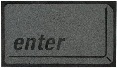
doormat.


something i found while browsing today...a doormat! what a great idea and its absolutely hilarious. i could definitely see myself having this at my front door hahaha.

wallpapers.

recently i have become really interested, okay slightly obsessed, with changing my desktop wallpapers on my computer (i know - it's kinda random). i don't know whether it is because i just get easily bored looking at the same thing or if it is that i like the challenge of finding new backgrounds on the computer. and this can be pretty challenging sometimes because if you search for wallpapers online, you get a bunch of these crappy websites with images of puppies or nude women - not really what i want on my desktop.

anyway, recently i have come across a bunch of different backgrounds one way or another. so i thought i would post some of my favorites so you can also enjoy the background fun - even if you don't change them nearly as often as i do!


i love these illustrated backgrounds, designed by maxim dalton

this one is just fun and seasonal, plus they offer a new background each month with a calendar of that specific month, designed by cecily ink

i am really loving these animal ones right now too, especially the ones above, but they also have some other nice ones with crabs, lions, and pumpkins...designed by pushmepullyoudesign

enjoy!

Tuesday, April 28, 2009

design.

this is a great quote that i saw today. unless you have really dealt with the incredibly frustrating (but amazing) world of design, you might not fully understand. but to those of you who do...enjoy! oh and i have definitely had my share of those 4am moments...haha

Design is 70% dealing with people, 3% the idea, 2% selling the idea, 2% the brief, 2% being pig headed, 1% printing, 3% eye for detail, .6% invoices, 2% coffee, .7% tracking, .1% warm glow, .6% panic, 1% 4am, .6% staring, .2% checking, 1% letting go, .8% keeping hold, .7% estimates, .3% checking, .4% proofs, .1% colour, .9% understanding, .4% marketing, 1% checking, .8% beach ball, .5% mice, .3% keynotes, .4% persuasion, .2% bragging, .5% smiling, 2% knowing when to stop. - Duane King

packaging.

soooo i know i have been seriously slacking, but now that i am officially done school, i hopefully will have more time to find some great design!

to start back up, i found some really great packaging designs. these are a bunch of random images, but they are some really neat designs. i have always been interested in packaging design - that is something that my school has never really focused on, at least i have never had an assignment about it. but its fun to see whats out there.


chinese tea box designed by carlo giovani

paint can packaging (each can is designed to match the color of jeans that fit inside - lots of fun colors for spring!) designed by levis

overall these package designs really aren't super special, but i included them because i love how the words create each specific product the package is selling, student work from fit

teastar - each spike of the star holds a different tea bag, unsure of the designer but it comes from the u.k.

milk cartons - i don't know exactly what it is about these containers, but i love them...perhaps its the fact that they brought some color to plain old milk, designed by david fung

Thursday, April 23, 2009

another animation.

sooooo today marks the end of finals! thank god. so hopefully now i will have some more time to post more - now that it is officially summer!

this is my third and final animation for my time based design class. i am pretty happy with it, but like with most projects there are always things that i would like to improve. the two things i wish were better are the transition between the first and second part and also my wording. writing does not come easily to me, so that part could definitely be stronger...but i had so much fun playing around with the type...i actually wish that i had more time to do more interesting things with the type...but there are only so many hours in the day.
again...hopefully more posts soon!

Wednesday, April 15, 2009

animation.

this is my second animation assignment for my time based design class. i am pretty happy with it...but there are definitely some things i would change. unfortunately i haven't had a chance to edit those things - maybe [hopefully] i will get to at some point. this was fun to make though and i just wanted to post something new!

Friday, April 10, 2009

turquoise.

the color of the day today is turquoise.

turquoise is a mix of blue and green and it has the same calming effects of these colors also relating back to its connection with the ocean. turquoise has a sweet feminine feel while the darker teal shades add lively sophistication. it also relates to creative expression, healing, independence, and generosity.

the shades of turquoise that are on the greener side are some of my favorite colors. i have never been a big fan of the turquoise stone...and that tends to be on the bluer side, so i guess that is why. but these are just some nice images that represent the color well!
1. Turquoise Tunnel Silhouette, 2. All you need is love. But a little chocolate now and then doesn't hurt., 3. turquoise, 4. giro tutto il mondo, 5. Turquoise Rocks!, 6. Mosaic in Turquoise and Rust, 7. Net, 8. tone on tone, 9. evening tree, 10. green & turquoise, 11. frosty, 12. Turquoise corner of my home, 13. Turquoise, 14. Nostalgic, 15. Turquoise Beads, 16. feeling turquoise

Thursday, April 9, 2009

waveforms.

i found this the other day on a random design website (and i am not going to give you the actual website because they have a lot of good stuff and over time i will probably use more of it!) so anyway...this designer decided to label the songs on this cd by depicting a song in one in squares of waveform. this gives every song a completely distinct image. there is so much that you could do with this in designing cd covers and things like that. the layout for this cd is pretty dumb...i am not going to lie, but my guess is that they did it this was just so you can see what their idea was. it was designed by joshua distler.
pretty cool.

Wednesday, April 1, 2009

animals.

i found these when i was browsing through the etsy shop. these animals are adorable and i love the designer's style. it reminds me of scrapbook pages in the sense that she uses different patterns and shapes to create the animals. they are really meant to hang in children's rooms...butttt i still really enjoy them.

i am torn between the elephant and the crab as my favorite!


here is a link to her etsy store!